01Logo
The Prism mark is the primary logo. It carries a violet-to-cyan glow and reads clearly on dark backgrounds, which is its preferred home.
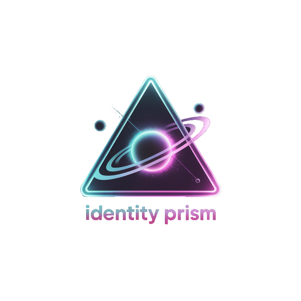
Primary mark · on dark
Download: phav.png (PNG, transparent)
On light · acceptable
Ensure adequate contrast; prefer the dark variant where possible.
Always pair the mark with the wordmark IDENTITY PRISM set in Orbitron when space allows. Maintain clear space around the logo equal to at least half the logo's height.
02Color Palette
The brand runs on a six-color spectrum against a near-black background (#050508). Cyan and violet are the core gradient; the rest are accent and semantic colors.
The signature brand gradient is linear-gradient(90deg, #22d3ee, #a78bfa) — used on primary buttons and key headlines. Gold marks tiers and achievement, green marks trust and "human cleared," red marks sybil risk, and pink marks social/engagement.
03Typography
Three typefaces, each with a distinct role. All are available on Google Fonts.
Headings, the wordmark, labels, and numeric stats. Weights 400 / 700 / 900. Use generous letter-spacing.
All body copy, paragraphs, and UI text. Weights 300–600.
Wallet addresses, scores, code samples, and any monospaced data.
04Usage Guidelines
Do
- Use the supplied
phav.pngat full resolution. - Keep clear space around the mark.
- Prefer the logo on dark or transparent backgrounds.
- Use the exact palette hex values.
- Pair display Orbitron with body Space Grotesk.
Don't
- Recolor, rotate, stretch, or add effects to the mark.
- Place the logo on busy or low-contrast backgrounds.
- Recreate the wordmark in a different typeface.
- Imply partnership or endorsement without permission.
- Use the brand for sybil farming or misleading drops.
Questions about usage, or need vector/additional formats? Email [email protected]. For product context, see the whitepaper or the landing page.